

This local coffee shop was starting a new chapter in a fresh space and needed a visual identity to match. The design is minimal and playful, with a warm, welcoming feel.
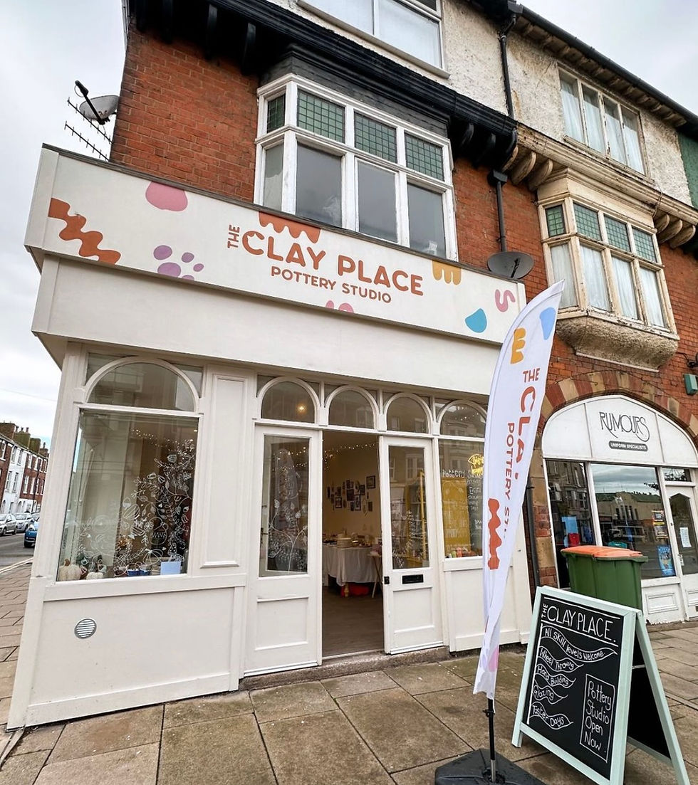
This visual identity was created for a physical pottery studio with a fun nature. Built around the client’s personal branding as a potter, the visual identity keeps things vibrant, playful, and full of personality.
Virtual Naomi is the second venture from the founder of Menoaid, this time bringing her bright, fun personality into the world of virtual assistance. The brand identity is a playful refresh of her previous design, refined to feel more polished while keeping things light, approachable, and full of energy.
Lahari, meaning wave in Sanskrit, is a yoga and wellness brand rooted in flow, balance, and gentle movement. The brand identity was designed to reflect that sense of calm and continuity, with soft, flowing lines, soothing colours, and organic forms throughout.
Welcome, dear readers! I'm Anja, and you're about to be taken on a digital newspaper tour of some of my 2024 projects. Enjoy!


A bright & friendly showcase of my work

A reimagined sunflower, carried over from the previous logo, brings a sense of continuity and personal meaning, while a subtle curve on the letter b echoes the shape of a coffee cup handle.
"She truly goes above and beyond and is one of the loveliest humans you will ever meet."
Alice - Bloom Coffee & Bakery

Menoaid is a beautifully considered menopause care brand, and this full brand identity was designed with meaning woven into every detail. Instead of a typical uterus icon, a freesia flower, her grandmother’s favourite, was used to subtly form the shape, creating a symbol that’s both elegant and deeply personal.
